"The most beautiful makeup for a woman is passion, but cosmetics are easier to buy."
—Yves Saint Laurent
Announcements
If you're new to this blog, then read our guides to the basics: Skin (Part I), Skin (Part II), The Supernatural, Color Theory I, Color Theory II, Eyes, and Brushes.
Also, check out the blogsale.
Contents
Favored
Art Tattler
the glamourai
The Non-Blonde
Perfume Shrine
Lisa Eldridge
Garance Doré
Smitten Kitchen
Into The Gloss
Grain de Musc
Lacquerized
Res Pulchrae
Drivel About Frivol The Selfish Seamstress
Killer Colours
Bois de Jasmin Glossed In Translation
Jak and Jil
Toto Kaelo
Worship at the House of Blues
I Smell Therefore I Am
Food Wishes
The Natural Haven
Messy Wands
1000 Fragrances
Moving Image Source
Wondegondigo
The Emperor's Old Clothes
M. Guerlain
Colin's Beauty Pages
Barney's jewelry department
Parfümrien
loodie loodie loodie
The Straight Dope
Sea of Shoes
London Makeup Girl
Sakecat's Scent Project
Asian Models
Ratzilla Cosme
Smart Skincare
Illustrated Obscurity
A.V. Club
Tom & Lorenzo: Mad Style
Eiderdown Press
Beauty and the Bullshit
La Garçonne Flame Warriors Everyday Beauty
Fashion Gone Rogue
Now Smell This
Dempeaux
Fashionista
The Cut
A Fevered Dictation
Nathan Branch
101 Cookbooks

When I saw this image in the December 2009 issue of Lucky, it created more excitement in me than I've felt about fashion in a long time. I have long loved tie-dye (I went to a hippie middle school), and I love the visual depth the t-shirt creates against the jacket. Being small both in stature and frame, visual depth isn't something that's always been easy for me to achieve. I've generally assumed depth to mean mixing textures in an outfit, leading to experiments with cable knits and tweeds that have inevitably ended in either adding bulk to my frame or drowning it. Either way, I was overheated and depth was not had. My confusion was compounded by endless viewings of What Not To Wear, in which Stacy and Clinton create visual interest through a mix of textures (satin, chiffon, various wools) and really girly accessories. It wasn't until I saw this look that something in my head clicked; I finally got that creating the look of depth in an outfit doesn't have to come from adding texture itself. Instead, it's more about literally creating visual interest by wearing something that draws the eye inward. In this look, specifically the middle picture, depth was created both by the tie-dye pattern and the mix of patterns in complimentary tones. The tie-dye itself shows variation in depth between brightness of color and tone which naturally draws the eye inward. In addition, the jacket brings its own depth with its mottled pattern while staying in the same color family. This is one of the quickest ways to introduce depth to an outfit: remain within a single color theme while incorporating variations in pattern, texture, or tonality.

This Calvin Klein shift gives an idea of how depth can be created through pattern alone. The ombre pattern literally draws the eye into the shift, creating dimension. Likewise, the texture of the dress (puckered cotton voile) creates further dimension. This is the difference between visual depth and adding a "pop" to an outfit, as would What Not To Wear. A pop is a statement that screams from an outfit, be it a bold color, accessory, or item of clothing. Visual depth actually draws the eye into the outfit, causing the viewer to look closer and become engaged in the outfit.

Visual depth can also be created through wearing black and leather together. Though this is typically done with black leather, the contrast of the almost burgandy tone of the brown, as well as the cage design, work together to create depth against the dark tones and tweeds of this Rodarte dress. The reason why leathers work so well to create depth is because they cause the eye to stop wandering and focus on them, creating contrast against the other elements of the outfit. This is particularly true in all-black outfits. Whether matte or patent, leather attracts both light and shadow, and anything that attracts light will naturally contrast with matte black, which absorbs it. This contrast creates the illusion of depth, the effect being heightened in all-black outfits, in which the total look is the interplay of light and shadow - in effect, the definition of depth.

One of my favorite ways to achieve depth is to take one main color - here it's black - and work with tones that compliment it. Despite the difference in colors themselves, the reds, blues, and yellows of this Dries van Noten blouse are similar in tone (they are all colors that have had black added to darken them). When paired with black itself, the contrast is quite striking, and the eye is drawn into the top. This is probably the easiest way to achieve visual depth, as we all have basic, neutral tones in our wardrobes to work with. I also find this look the easiest on the eye (coat excepted); it requires the least thought, and all the tones work so well together that the outfit flows nicely, especially when contrasted with the more aggressive look of the jackets and t-shirts at the top.
Labels: calvin klein, dries van noten, fashion notes, lucky, proenza schouler, rodarte
12/30/2009 [1]

I am not a jewelry person, but I just love this twig ring by Elizabeth and James ($395.00). Of the jewelry I like, I'm partial to band rings and designs inspired by nature, and I especially like the dimension the mixed metals lend the ring. But would I buy it? No, and here's why:
- It's a very cool ring, and "cool" has a shelf life of two years.
- For $395, I would expect to wear a ring for ten years, not just two.
- Were I to see a knockoff of this ring at, say, Kmart, I wouldn't buy it. It would be ugly and cheap, and I wouldn't think twice about it. Were it at Kmart and distributed by one of Mary-Kate and Ashley Olsen's umpteen brands, though, I might be tempted to buy it just to sport it for a couple of years. I'd at least think about it.
Labels: elizabeth and james, fashion notes, mary-kate olsen
12/22/2009 [2]
Image by 무적핑크 (Super Pink); captions translated by Anne.

My favorite webcomic is "Realistic and Objective Fairy Tales," which is the doing of art student Mujeok-Pink, or "Super Pink" in English. Super Pink takes canonical tales and puts a fresh spin on them, taking the narrative in a totally unexpected direction; her repertoire includes the Grimms brothers, traditional Korean folktales, Aesop's fables, works of fiction such as Oscar Wilde's "The Happy Prince" and O. Henry's "The Last Leaf," as well as cultural idioms such as Tetris. New episodes are posted weekly, and are by turns cynical, silly, profound, or even tragic... but always side-splittingly funny.
I've recently become a huge fan of Jaurim and have a bit of a girl-crush on their lead singer Kim Yoon-Ah (not to be confused with the equally beautiful and talented Kim Yuna). Lest you take soulless bubblegum/sexed-up K-pop for Korean music, I tell you, this is the real thing, and I was elated to discover it. Since Jaurim began on the indie scene in 1997, their unique sound has been described as "elfin" or "catlike," due in large part to Kim Yoon-Ah's keening, expressive voice—in my humble opinion, a voice none can listen to and stay indifferent. Plus, the woman really rocks a wine-stained lip.

I bought a knit piece this last fall that can only be described as "a scarf with sleeves," or "two sleeves knitted into a scarf." I regretted the decision at first, wondering where I would wear a scarf with sleeves. As it turns out, everywhere. It goes around the neck like a normal scarf and also slips over the hands for immediate warmth—no need to fiddle with taking gloves on and off. And it looks chic enough, as it drapes like a shawl without the fuss of trying to keep one on your shoulders. If you plunge your entire arm into the slit of the sleeve, you can even create a shrug (as seen above on the model).

Since the weather has grown dry I apply body moisturizer after showering, but of late, my skin has become dry and flaky. No amount of moisturizer I use seems to make a difference: indeed, the rougher my skin gets, the worse the moisturizer absorbs. So yesterday, I went straight to The Face Shop and picked up their Sweet Body Moisture Exfoliator. I like that it's an all-in-one product—a "moisturizing" body wash with exfoliating microbeads—and it did help smoothe my winter-chapped legs and ankles, but it didn't give me the "skin-like-silk" feeling I expected from an exfoliator (maybe I'm just picky). It may help to leave the skin to soak and to use very generous amounts of the stuff—at any rate, I plan to be using this product up fast as possible so that I can move on to L'Oreal Exfotonic, which gets very good reviews, though twice as expensive.
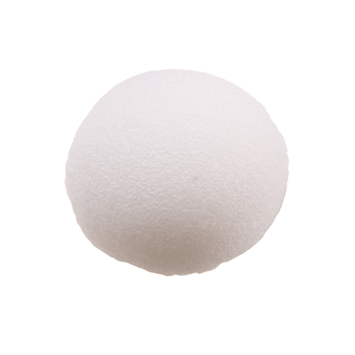
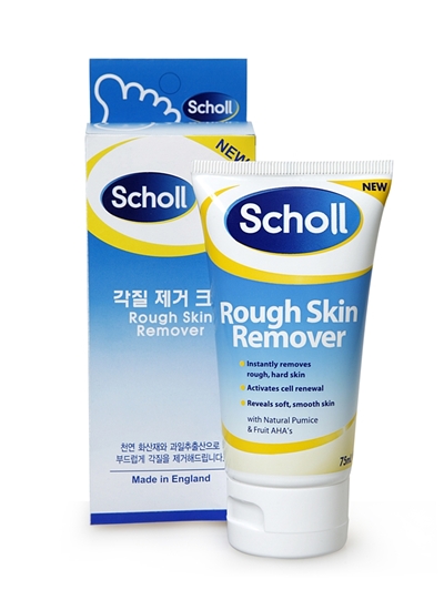
While I was there, I also picked up this "natural jelly cleansing puff," which I am much more impressed with. It's a round sponge made from a plant-based jelly, and is consequently so soft and soothing on the skin that you'd never guess it exfoliates as well. I also have my eye on Scholl Rough Skin Removing Foot Cream.


I recently had occasion to visit "Bakseok Gogae," a restaurant specializing in north-of-the-DMZ-style food—and considering that North Korea borders on the windswept plains of Northern China and Siberia, it makes sense that North Koreans do winter comfort food like nobody's business. The pancakes (topped with egg and done to the perfect pitch of golden-brown) and dumplings are delicious, but the keystone of the menu is the "kalgooksoo," handmade noodles served in a rich beef bone broth and garnished with succulent zucchini and kimchi.
Besides that, nothing is more comforting in winter than a blanket and a hot cup of tea. I'm growing very fond of mint tea, its quiet piquancy providing another kind of pick-me-up altogether different from the tarred rush of coffee.
Labels: comics, consumer diaries, jaurim, kim yoon-ah, l'oreal, scholl, the face shop, 무적핑크 (super pink)
12/17/2009 [4]

The infamous Angelina cover.
Thanks to my Delta SkyMile points, I have a two-year subscription to Harper's Bazaar. Every time I receive a new issue, I groan. I actually dread receiving this magazine. I have only ever had this reaction to one other subscription, the abominally-written Nylon, which I received free for a year and hated so much that I didn't even renew it for free for another year. I just wanted rid of it; so with Harper's Bazaar.
I have very strong emotional connections with Harper's Bazaar. I've read it off and on since I was twelve. It's the first fashion magazine I picked up, and its editorials were ultimately the reason I fell in love with fashion in the first place. I have a deep-seeded need to see the magazine do well. And so it did under Liz Tilberis's editorship; from 1992-1999, Tilberis transformed the magazine into one of the preeminent fashion magazines in this country, in my mind beating out Vogue through an emphasis on forward fashion and the best photography and styling at the time. I can remember looking through Vogue at the time. Vogue's clothes would be pretty, and the shoots would be pretty, but none of it is memorable. In contrast, Harper's Bazaar produced individual shots and editorials that I can remember to this day. When I remember the 90s, I rarely think of my own experiences in life. It's the imagery of Harper's Bazaar I remember.

Since Tilberis's run, the magazine has gone through several editors, each running it that much further into the ground. Under Glenda Bailey, the current editor, the magazine has lost almost all identity, which brings me to my first point: the magazine lacks editorial focus. Simply put, I cannot tell you what is the magazine's point of view. Harper's Bazaar isn't alone in this - the industry has been in a state of transition for many years, and I find most American fashion magazines suffer from this to some degree. However, Harper's Bazaar is the most egregious offender as the magazine tries to be all things to all people. From the regular column "Fabulous At Every Age" to the above feature, in which Leighton Meester was aged to represent what fashion for every age might look like, the magazine literally tries to offer up high-end answers for everyone. What it doesn't deliver is a signature Harper's Bazaar answer to each age's style dilemma or, for that matter, to anything. This is in direct contrast to the rest of the top American fashion magazines, which are driven by a clear, consistent editorial voice that determines which designers will be shown, which issues will be addressed, and the method in which everything will be presented. Both verbally and visually, there is a clear, cohesive voice present at Vogue (money, young American designers, feminine styling), Elle (youthful, feminine edge, hi/lo), and even Lucky (mid-range designers, draping and soft fabrics, girly, a conversation with your best girlfriend). Pick up Harper's Bazaar and you'll find this element simply isn't present. As such, the magazine ends up with poorly conceived editorials and no clear, discernible Harper's Bazaar "look." If pressed, I could easily put together an outfit that mimics what you'd find in Vogue or Lucky. Not so with Harper's Bazaar. Simply put, the magazine is like that person who can ask all the right questions and provide all the right answers, but cannot answer what he himself likes or doesn't like because he doesn't know himself. This is a dangerous ignorance in an industry in which brand identity generates millions, even billions, of dollars a year.
Beyond this, the editors at Harper's Bazaar don't even seem to know what they themselves have said. Nothing about a magazine has angered me more than seeing Harper's Bazaar recycle its own articles. I cannot tell you how many times I have seen this magazine rehash the same articles all in the span of a couple of years. The cost-per-wear article, in which the term "cost-per-wear" is defined and examples of such are given, is so constantly recycled that it should become its own feature. Another overused feature involves how to acheive "It Girl" or "cool girl" style, which involves naming the current It Girls and cool girls of the time. I've seen this article 2-3 times in the past handful of years. The It Girls were pretty much the same from one time to the next. This would never happen at Vogue, which may espouse a pretty boring style philosophy, but can at least come up with new topics for articles each month.

Maybe my biggest complaint about Harper's Bazaar is that it's boring. It feels like a chore just to get through it. The writing's not that great. It's certainly not compelling. The choice of subject matter for articles isn't that interesting. Nothing's covered in much depth, so there aren't insights to be found. Most damning of all, though, is the boring photography. Harper's Bazaar used to be the preeminent magazine in this country for fashion photography, and rightly so. As seen in the above shot from the Tilberis years, the photography used to be compelling. This is a standalone picture that clearly tells a story without the need for the rest of the editorial. These pictures do not exist in Harper's Bazaar anymore. Standout editorials are hard to come by, as well. In the past few years, there's been the editorial where Jessica Stam and another model were styled as Amish girls. There's the one where Snejana Onopka wore ethereal clothes, shot with pink lighting. There have been a couple more, but off the top of my head, that's it. About one editorial a year will be a standout. That is not exceptional. From my point of view, a fashion magazine's editorials are its bread and butter. They define a magazine's point of view and relevance. Harper's Bazaar clearly falls short on both of these points, and that is a shame for a magazine that nearly singlehandedly produced the entirety of fashion iconography of the 1990s.

I've noticed the past few months that Harper's Bazaar seems to be offering more and more articles specifically aimed at women in their late 40s and up, including anti-aging features, a somewhat regular column by Rita Wilson, and regular interviews with fashion cognoscenti of that age group. If this is the direction the magazine is going in, I applaud them for it. There aren't any high fashion magazines specifically concentrated on fashion for women of that age group, and that could be a great addition to the current roster of glossies. If this is the case, though, I hope the magazine cuts out the rest of its content. Try as it might, it cannot be all things to all people. With the exception of Vogue, fashion magazines cater primarily to one age group at a time. This seems to work well for most of them, and if the magazine to stay specific to its point of view, it could work for Harper's Bazaar, too.
Labels: glossies, harper's bazaar
12/15/2009 [2]
BEST ACCESSORY

I am not a jewelry person, but from Balenciaga's fall show, this cuff is the one thing I responded to. I just find the curvature of it so beautiful. Not only does it emphasize the graceful curve between a woman's arm and hand, it also reflects on the curves of women themselves. This is just the perfect thing to place at the end of a very long, very lean sleeve.
BEST FUR

I love this punch of fur and tweed from Miu Miu. Fashion is besieged with couture embellishments right now, and this serves as an antidote to that. Though dramatic, there is something very haphazard and undone about simply draping an embellishment over your clothes, and the intermix of grey and white really plays up the coat's inky black. Plus, I just love the shoes.
BEST WEARABLE COAT

This has to be one of the prettiest coats I've ever seen. Feminine, girly, and slightly retro, this Miu Miu coat is something I would have exclaimed over when I was in my early 20s and going through the phase of thinking the only style icon was Audrey Hepburn and clothing had to be tasteful. I have evolved since then, but I still think this is one of the most easily and enjoyably wearable coats I can remember.
BEST FASHION COAT

As much as I love the above, this Miu Miu outfit is the one I'd actually wear. The open top speaks to my need for dramatic clothing and face-framing necklines, and the vest's slim bottom keeps everything fitted and cool. This vest is something I could easily wear years from now, as it's in keeping with my general style, and is not likely to easily date.
BEST LOOK OVERALL

While reviewing the fall shows, this appearance by Miuccia Prada from the end of Prada's show was easily my "eureka" moment. I love everything about this look: the sequins, the slim fit of the dress, the cardigan over the dress, the socks with sandals, how everything goes together, the general frumpiness of the outfit that Miuccia morphs into hip grandma. Essentially, this is what modern fashion is meant to be - taking the clothes and making them your own. Easy to say, hard to do, harder even to do now that we've replaced culture with advertising and can't get away from the hard sell. Despite it all, this outfit tells me a lot about Miuccia Prada herself, as well as about the brand. From this outfit, I can glean that Miuccia Prada is an individual, she should style and model in her ad campaigns, and that Prada is meant to be worn, not venerated, idolized, or scorned. This ended up being my favorite picture from the fall shows, and I think it serves as a better advertisement than all the fall ad campaigns I've seen.
Labels: balenciaga, fashion notes, miu miu, prada
12/08/2009 [2]

I don't like lipgloss. I'm not sure why; I just know I felt too old for it even as a teenager, and although I've owned a number of glosses over the years, I've never been as excited over gloss as I get over lipstick. (Granted, I get very excited over lipstick. It's a thing.) Gloss is sticky or slippery, it encourages lipstick to slide off (and much as I love lipstick, I am lazy about reapplying); it feels too thick, too "done". And I think my face looks washed out without some pigment on the lips, which is probably part of why I've never taken to nude lipsticks.
But inspired by this post, I feel obliged to try any Chanel colour called Coromandel, and swatches of Chanel's Rouge Allure Laque in that shade piqued my interest even more. And I have to say, although I'd normally feel absurd shelling out this much for a lipstick, the Rouge Allure Laques are a gorgeous product. Coromandel is a blood red on me, which means it would probably lean orange on anyone else. It's a beautiful shade, but it's the consistency that makes this special. The Rouge Allure Laques are really liquid lipsticks, not glosses; they have intense, concentrated pigment, made even more dramatic by the glossy finish.
This is a thoughtfully designed product, with the usual glossy black Chanel packaging. The doe's-foot applicator is slightly concave at the top, to ease application; the colour stays true; it stays on beautifully, it does not bleed (unless I blot, then it bleeds for some reason), it feels light and balmlike and lovely. This is head and shoulders above any other gloss or liquid lipstick I've tried.
Edited to add a photo (I think every face I make in these photos looks weird, but there we have it). As you can see, Coromandel is a very bright red.

Labels: beauty notes, chanel
12/05/2009 [4]
When it came to Best in Show, I had difficulty this round deciding between two equally worthy shows. Both Isabel Marant and Miu Miu came up with collections that made me stop and look again and again. Ultimately, Isabel Marant won out with a factor that Miu Miu simply didn't bring: the clothes looked wearable. In fact, they looked like they had been worn as they came down the runway, and that is exactly what I want right now. I want to see women wearing clothes that look like they've been worn and loved, not clothes that look like museum pieces to be worn gently or in outfits that look like something that came from a magazine. As much as I love fashion, I am tired of the current phase of dressing in editorial styling. I am all for aspirational dressing - I will never be won over by the likes of Celine or Ralph Lauren - but I am so tired of everyone copping the same look and same attitude to pronounce themselves "individuals." You know what happens when everyone, individual and corporation alike, adopts anti-establishmentarianism? Hot Topic. We are living in an Alexander Wang/Rick Owens/model streetstyle of a Hot Topic moment. Now onto some real clothes.

The Isabel Marant show managed to achieve something very difficult; that is, present very wearable clothes that, when put together, look cool. This is something that fashion largely strives for and that, at the moment, is failing to do. There's a lot of cool clothing out there, and there are some wearable clothes, but rarely do the two meet. This is an example of that meeting. There's nothing very special about the clothes themselves: they're just a mismatched blouse and skirt, an oversized blazer, a belt, a pouch, and boots. It's the fact that they're all roughly within the same color palette, paired with a very slim foundational silhouette, that allows such experimentation with proportion, texture, and assumption (rough with soft, masculine with feminine) to succeed. Plus, the clothes are fundamentally cool. Though impossible to wear, there's nothing cooler than an oversized men's style blazer, or studded ankle boots, or a skinny belt encircling Erin Wasson's waist, or, when it comes down to it, Erin Wasson.

One of the particular successes of this collection was Marant's ability to adopt the best of Paris's fashion-forward designs and translate them in an arguably more tolerable, and certainly more wearable, style. Take the overemphasized shoulder. Marant's placed it on a tweed Chanel-style jacket and paired it with clothing that is neither couture nor immediately identifiable - that is, she made it normal. This is a definite look, but without the excesses and vulgarity that define the work of other designers. It may not be for everyone, but this jacket could realistically be worn through your day-to-day activities. Marant also successfully interpreted the 80s-inspired floral dress so strongly represented in the fall collections (top picture), as well as 80s inspiration overall.

In addition to interpreting fashion for the masses, Marant also took on the trends that would be heavily adopted by streetstylists both in pre-fall and fall, one such trend being leopard print. Leopard print's slowly built up to being everywhere, including Marant's leopard print coats, but I prefer this print skirt. Given how it hugs the body and its neutral print, it both punctuates the oufit while staying in the background of what is an all-black outfit. This is a print that couldn't be seen as ostentatious, matronly, or vintage. It is a very clever way of appropriating a trend to make it wearable and cool. Other trends Marant adopted included studding, leather, knee-high boots, and fur.

I think at least part of Marant's success comes from her basically telling the audience how to wear her clothes in a very realistic manner. Walk away from this show and you know what to pair each item with, and half of those items will come out of the clothes you already own. There are no unrealistic couture embellishments here. It's just a tank top with skinny jeans and a coat, and if you provide the tank top and skinny jeans, Isabel Marant will provide you with the coat. Perhaps a bra is in order, but it seems to me this is a much surer sell than a higher-end designer cutting the perfectly fitted jacket that ultimately, realistically only goes with the rest of that designer's perfectly cut collection.

Overall, I have to say this is my favorite look. It has everything I love: a well-fitted dress, visual depth, eccentricity, and a bit of not really caring about it all. It's that last bit that gives attitude and what we call "cool" to things and to people, and it's that identifiable, personal cool that sold me on this show.
Labels: fashion notes, isabel marant
12/03/2009 [2]
Subscribe to
Posts [Atom]. Or
follow on bloglovin'. If
you'd like to contact Dain,
feel free to email me.
I'm also on Pinterest.
The Mnemonic Sense
Most Wanted
The Beauty Primer
Lookbook
Bestsellers
Consumer Diaries
Closet Confidential
On The Label
Beauty Notebook
The Hit List
Color Me In
The Makeup Artist
Wedding Bells
Globe Trotter
Desert Island
perfume notes
beauty notes
fashion notes
culture notes
minimalism
chypre arc
floral arc
fresh arc
masculines arc
gourmands
& orientals arc
Archives
August 2008
September 2008
October 2008
November 2008
December 2008
January 2009
February 2009
March 2009
April 2009
May 2009
June 2009
July 2009
August 2009
September 2009
October 2009
November 2009
December 2009
January 2010
February 2010
March 2010
April 2010
May 2010
August 2010
November 2010
December 2010
January 2011
March 2011
August 2011
September 2011
October 2011
November 2011
December 2011
January 2012
February 2012
June 2012
July 2012
August 2012
September 2012
October 2012
December 2012
January 2013
February 2013
March 2013
June 2013
July 2013
Images
Photobucket